Hello everyone!
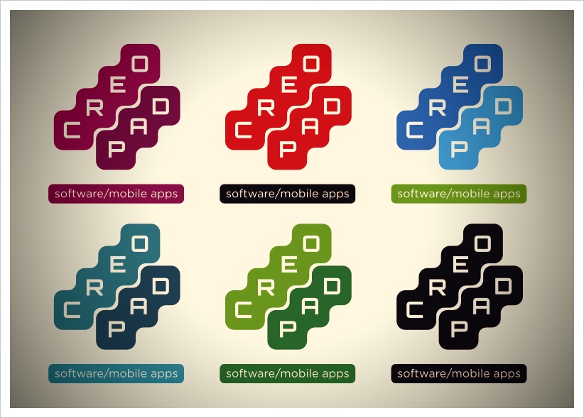
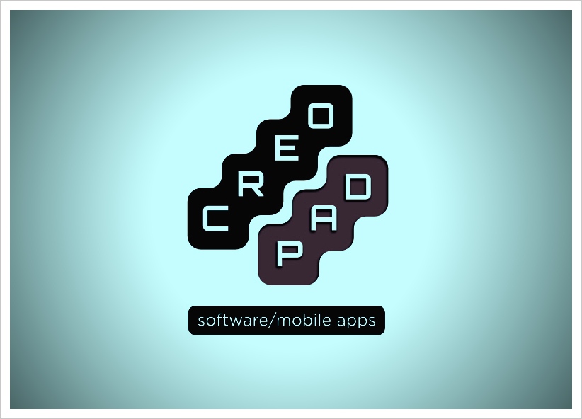
This is my recent project : “Creopad” logo for software company. The logo is abstract,simple and readable .I based it on simple shapes (squares with rounded corners).Anyway, below I put my video and some other colors versions. Judge for yourself . Do you like or dislike it? Hmm ,Let me know about it .Your comments count.


Comments are closed.